

Carrd doesn’t have a native carousel website element. It only has a Slideshow element, which is a little different from a carousel.
In this tutorial, you’ll learn the difference between the two. I’ll also show you how to add a carousel to your site using a custom code embed. The article includes the code, along with instructions on how to customize it.

What Is a Carousel?
A carousel is a user interface element that displays multiple pieces of content in a horizontal row. Users can move through the items using arrows, buttons, swipes, or sometimes automatic scrolling. Unlike a slideshow, a carousel can show several items at the same time, allowing visitors to see what comes next.
The name comes from the carousel, a circular amusement ride where seats or objects move around a central point. The idea was later adopted in interface design because it describes content that moves through a repeating sequence.
Carousels became particularly common on websites as screens became smaller and designers needed ways to display more content without taking up too much vertical space. Online shops use them for product collections, while portfolios, galleries, testimonials, and related-content sections can use them to present several items in a limited area.
Carousel vs. Slideshow in Carrd
Although carousels and slideshows can look similar, they display and move through content in different ways.
| Slideshow | Carousel |
|---|---|
| Usually shows one slide at a time | Can show multiple items at once |
| Content replaces the current slide | Items move horizontally |
| Often used for hero images or full sections | Often used for portfolios, cards, products, or galleries |
| Navigation changes the displayed slide | Navigation moves through a row or track |
| Available as a native Carrd element | Requires custom code in Carrd |
When Should You Use a Carousel?
Some common use cases for carousels include:
- Testimonials — Display several customer reviews without taking up too much vertical space.
- Related posts — Show multiple articles or resources visitors might want to explore next.
- Blog posts — Highlight several recent or featured posts in a compact section.
- Image galleries — Let visitors browse through multiple images without creating a long page.
- Portfolio projects — Present several projects in one row while keeping the page visually clean.
- Product cards — Display multiple products or services and let visitors browse between them.
Does Carrd Have a Carousel?
No, Carrd does not have a native carousel element. It does have a native Slideshow element, but if you want to create a carousel, you need to use custom code with Carrd’s Embed element.
The Embed element is available on the Pro Standard plan and higher. If you are using the Free or Pro Lite plan, you cannot add custom code to your Carrd site using an Embed element.
In the next section, I’ll show you how to add a simple responsive carousel using custom HTML, CSS, and JavaScript.
How to Add a Carousel to Carrd
You need to create a Carrd account and purchase either the Pro Standard or Pro Plus plan. Then, go to your Carrd dashboard and choose whether you want to start from scratch or use a template. If you already have a Carrd account and some sites in development, select the site you want to edit.
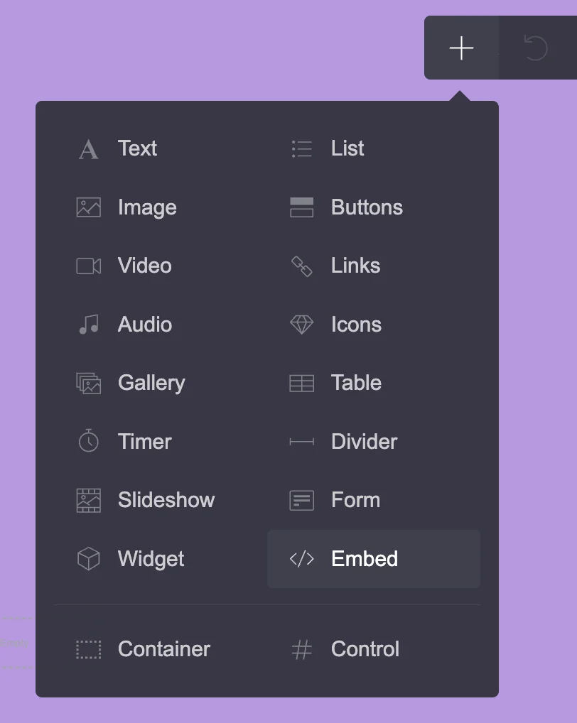
- Inside the Carrd editor, click the Plus (+) icon in the top menu and select Embed.
- You should now see a grey Embed element on your page. Click on it to open its settings in the left menu.
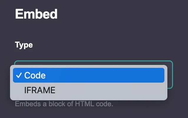
- In this menu, you can select the type of embed you want to use: Code or Iframe.
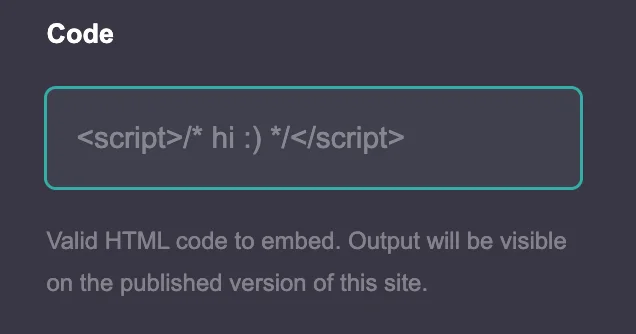
- When you select Code, you can add a title, choose a style (Inline or Hidden), and enter your code. You will also see an option to defer script tags.
- If you choose Iframe, you can add a title and URL and adjust its width, height, aspect ratio, and margins. You can also control whether the iframe is allowed to use features such as the camera, fullscreen mode, and motion sensors. The Iframe option also includes mobile customization, with either automatic or manual margin settings.
For this tutorial, select Code, as the carousel below uses HTML, CSS, and JavaScript. Embed Style will be set to Inline. For Embed style Hidden you can check my tutorial for How to Add Cookie Banner to your Carrd Site.
Code vs. Iframe: What’s the Difference?
Code lets you add custom HTML, CSS, and JavaScript directly to your Carrd site. It is commonly used for custom elements and interactions, such as carousels, sliders, animations, forms, and other features that Carrd does not offer natively.
Code lets you add custom HTML, CSS, and JavaScript directly to your Carrd site. It is commonly used for custom elements and interactions, such as carousels, sliders, animations, forms, and other features that Carrd does not offer natively.
Carrd Carousel Code
The code below creates a responsive image carousel with navigation arrows. It displays three images at a time on desktop and one image at a time on mobile.
<!-- CAROUSEL HTML -->
<div class="custom-carousel">
<div class="carousel-slides">
<div class="slide">
<img src="ADD YOR URL LINK" alt="ADD YOR IMAGE DESCRIPTION">
</div>
<div class="slide">
<img src="ADD YOR URL LINK" alt="ADD YOR IMAGE DESCRIPTION">
</div>
<div class="slide">
<img src="ADD YOR URL LINK" alt="ADD YOR IMAGE DESCRIPTION">
</div>
<div class="slide">
<img src="ADD YOR URL LINK" alt="ADD YOR IMAGE DESCRIPTION">
</div>
</div>
<!-- Arrows -->
<button class="prev-btn" type="button" aria-label="Previous image">
❮
</button>
<button class="next-btn" type="button" aria-label="Next image">
❯
</button>
</div>
<!-- CAROUSEL STYLES -->
<style>
.custom-carousel {
--carousel-columns: 2;
--carousel-gap: 20px;
--carousel-height: 280px;
position: relative;
width: 100%;
overflow: hidden;
box-sizing: border-box;
}
.carousel-slides {
display: flex;
flex-wrap: nowrap;
gap: var(--carousel-gap);
width: 100%;
transition: transform 0.4s ease;
}
.slide {
flex: 0 0 calc(
(100% - (var(--carousel-gap) * (var(--carousel-columns) - 1)))
/ var(--carousel-columns)
);
width: calc(
(100% - (var(--carousel-gap) * (var(--carousel-columns) - 1)))
/ var(--carousel-columns)
);
height: var(--carousel-height);
min-width: 0;
overflow: hidden;
border-radius: 12px;
box-sizing: border-box;
}
.slide img {
display: block;
width: 100%;
height: 100%;
object-fit: cover;
object-position: center;
}
/* Arrows */
.prev-btn,
.next-btn {
position: absolute;
top: 50%;
z-index: 2;
display: flex;
align-items: center;
justify-content: center;
width: 40px;
height: 40px;
padding: 0;
border: none;
border-radius: 50%;
background: rgba(0, 0, 0, 0.55);
color: white;
font-size:clamp(14px, 0.875rem + ((1vw - 3.2px) * 0.625), 20px);
line-height: 1;
cursor: pointer;
transform: translateY(-50%);
}
.prev-btn {
left: 10px;
}
.next-btn {
right: 10px;
}
.prev-btn:hover,
.next-btn:hover {
background: rgba(0, 0, 0, 0.8);
}
/* MOBILE */
@media (max-width: 736px) {
.custom-carousel {
--carousel-gap: 12px;
}
.slide {
flex: 0 0 100%;
width: 100%;
}
.prev-btn,
.next-btn {
width: 34px;
height: 34px;
font-size: 18px;
}
}
</style>
<!-- CAROUSEL SCRIPT -->
<script>
(function () {
const carousels =
document.querySelectorAll('.custom-carousel');
carousels.forEach(function (carousel) {
const track =
carousel.querySelector('.carousel-slides');
const slides =
carousel.querySelectorAll('.slide');
const prev =
carousel.querySelector('.prev-btn');
const next =
carousel.querySelector('.next-btn');
let currentIndex = 0;
function getVisibleSlides() {
if (window.innerWidth <= 736) {
return 1;
}
const columns = parseInt(
getComputedStyle(carousel)
.getPropertyValue('--carousel-columns'),
10
);
return Math.max(1, columns || 3);
}
function getGap() {
return parseFloat(
getComputedStyle(track).gap
) || 0;
}
function getMaxIndex() {
return Math.max(
0,
slides.length - getVisibleSlides()
);
}
function updateCarousel() {
if (!slides.length) return;
const maxIndex =
getMaxIndex();
if (currentIndex > maxIndex) {
currentIndex = maxIndex;
}
const slideWidth =
slides[0].getBoundingClientRect().width;
const offset =
currentIndex *
(slideWidth + getGap());
track.style.transform =
'translateX(-' + offset + 'px)';
const hasOverflow =
slides.length > getVisibleSlides();
prev.style.display =
hasOverflow ? 'flex' : 'none';
next.style.display =
hasOverflow ? 'flex' : 'none';
}
next.addEventListener(
'click',
function () {
const maxIndex =
getMaxIndex();
if (currentIndex < maxIndex) {
currentIndex++;
} else {
currentIndex = 0;
}
updateCarousel();
}
);
prev.addEventListener(
'click',
function () {
const maxIndex =
getMaxIndex();
if (currentIndex > 0) {
currentIndex--;
} else {
currentIndex = maxIndex;
}
updateCarousel();
}
);
window.addEventListener(
'resize',
updateCarousel
);
updateCarousel();
});
})();
</script>How to Customize the Carousel
You can customize the carousel without changing most of the code. The main settings you may want to change are the images, number of columns, spacing, and image height.
Add Your Own Images
Replace the image URLs in the <img> elements with your own image URLs.
For example:
<img src=”ADD YOR URL LINK” alt=”ADD YOR IMAGE DESCRIPTION”>
You can also change the alt text to describe each image. This helps make your carousel more accessible.
To add more images, copy an entire .slide block and replace the image URL.
To remove an image, delete its complete .slide block.
Change the Number of Images
The carousel currently displays two images at a time on desktop.
You can change this number here:
–carousel-columns: 2;
For example:
–carousel-columns: 3;
will display three images at a time on desktop.
You can use 1, 2, 3, 4, or more depending on the width of your carousel.
On mobile, the carousel automatically displays one image at a time.
Change the Space Between Images
You can change the gap between the images here:
–carousel-gap: 20px;
For example:
–carousel-gap: 10px;
will create a smaller gap.
The mobile version uses a separate 12px gap.
Change the Image Height
The image height is controlled by:
–carousel-height: 280px;
You can increase or decrease this value depending on the look you want.
The images use object-fit: cover, so they fill the available space without stretching. This means that changing the height may crop parts of an image.
Adjust the Carousel Size in Carrd
For the easiest way to control the overall size of your carousel, place the Embed element inside a Carrd Container.
You can then use the Container settings to control the carousel’s width, padding, and margins.
This is easier than changing the carousel’s CSS and gives you more control over how it fits into the rest of your page.
For example, you can use a narrower Container if you want a more compact carousel, or increase the padding if you want more space around it.
A Note About the Code
You do not need to understand every part of the code to use this carousel.
For most customizations, you only need to change the image URLs, number of columns, gap, or height described above.
Avoid changing the JavaScript unless you know what you are doing. It controls how the carousel moves and calculates which images should be visible.
Common Carrd Carousel Problems
A custom carousel can behave differently depending on your Carrd layout, screen size, and the code settings. Here are some common problems you may encounter.
The Carousel Looks Too Small
If the carousel looks smaller than expected, check the Carrd Container that holds the Embed element.
A narrow Container will also make the carousel narrower. You can adjust the Container width, padding, and margins in Carrd without changing the carousel code.
Images Have Different Heights
Images with different aspect ratios can look uneven if the carousel does not use a fixed height.
This carousel uses a fixed height and object-fit: cover. This keeps all images the same height while cropping them to fit the available space.
If you want to change the height, edit the –carousel-height value in the code.
The Last Image Does Not Appear
The carousel automatically calculates how many images are visible and how far it needs to move.
If you change the number of columns, the JavaScript automatically adjusts the navigation. If the last image still does not appear, check that you have not accidentally removed or changed part of the carousel code.
The Arrows Do Not Work
If the arrows are visible but do nothing, check that the complete HTML, CSS, and JavaScript code is inside the same Carrd Embed element.
Also check that you have not accidentally removed part of the JavaScript when editing the code.
The Carousel Works on Desktop but Not on Mobile
This carousel uses different settings for desktop and mobile.
You can choose how many images appear at once on desktop by changing the –carousel-columns value. On mobile, the carousel automatically displays one image at a time.
Always test your carousel on both desktop and mobile after making changes.
The Carousel Does Not Move Smoothly
The carousel uses a CSS transition to animate the movement between images.
You can change the transition speed in the .carousel-slides CSS if you want a faster or slower animation.
For example, this value controls the transition:
transition: transform 0.4s ease;
A smaller value makes the movement faster, while a larger value makes it slower.
Changes to the Code Do Not Appear
After editing your carousel, save and publish your Carrd site and refresh the published page.
If a change still does not appear, check the code for missing brackets, quotation marks, or HTML tags.
When working with custom code, make one change at a time. This makes it easier to find the setting that caused a problem.
Final Words
A custom carousel gives you more flexibility than Carrd’s native Slideshow element. However, it can also be more complicated to set up and customize, especially if you are not familiar with HTML, CSS, and JavaScript.
If you are comfortable editing code, you can use the examples in this tutorial as a starting point and adjust them to fit your website. If you are not sure how to modify the code or something is not working as expected, you can contact me for help.
I can help you troubleshoot the carousel, adjust its appearance, or modify the code for your Carrd website.