

When you are designing your website yourself and you are not a skilled designer, choosing the right colors can be difficult. You may not know where to start or how to combine colors without making your website look too busy.
That’s why I decided to write this article to give you a better idea of where to start and how to choose a color palette that works well for your website.
Why Does Your Website Color Palette Matter?
It is a well-known fact that different colors can create different moods, atmospheres, and emotions. This is why choosing the right colors for your website is more than just a matter of personal taste. You need to think about what your brand represents and what you want to communicate to your visitors.
Color can influence how people perceive your website before they even read the text. A dark palette can create a completely different feeling from a bright and colorful one. The same applies to the colors you use for buttons, links, backgrounds, and other important website elements.
Website design has also changed a lot over the years. If you look at some of the first websites from the 1990s and early 2000s, you will find plenty of colorful backgrounds, animated elements, decorative fonts, and sometimes several competing colors on a single page. Some of these websites look quite funny to us today, while others lean more towards an artsy form of expression or a kind of visual subversion. They also show how much web design has evolved and how different ideas about what a website should look like can be.
Today, many websites use simpler color palettes because they are easier to navigate and more comfortable to read. However, this does not mean that your website has to be minimalist or use only neutral colors. The important thing is to choose colors intentionally and make sure they work well together.
A good color palette can help your website feel more professional, recognizable, and consistent. It can also make it easier for visitors to understand which elements are important and where they should click.
How Many Colors Should a Website Have?
When it comes to website colors, less is usually more. Using too many colors can make your website feel chaotic and distract visitors from the content and important elements.
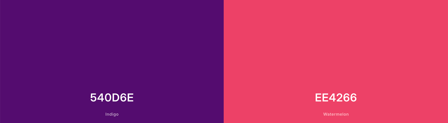
For most websites, three to five main colors are enough. You can have one primary color, one accent color, a background color, and a text color. You can then use different shades of these colors where needed.
This does not mean that you cannot create a colorful website. The goal is to give each color a purpose and make sure the overall palette feels consistent. If everything is trying to attract attention at the same time, nothing really stands out.
Start With Your Brand or Website Style
Before choosing specific colors, think about what you want your website and brand to feel like. You do not need to have a complete brand identity or a professional design strategy. A few simple questions can help you define the direction.
Ask yourself:
- What emotions should people associate with my brand? Should it feel calm, energetic, mysterious, playful, elegant, serious, trustworthy, rebellious, or creative?
- What should people feel when they first visit my website? Curious? Excited? Relaxed? Inspired? Safe?
- If my brand were a person, what would they be like? Think about their personality, clothes, interests, and attitude.
- If my brand were an animal, what would it be? A black cat, a wolf, a butterfly, a crow, or perhaps something completely unexpected? Think about why you chose it.
- What places or environments fit my brand? A dark nightclub, a sunny Mediterranean village, a brutalist building, a forest, a luxury hotel, or a futuristic city?
- What materials or textures fit the brand? Think about metal, concrete, glass, paper, wood, velvet, chrome, or something else.
- Are there colors I already associate with my brand? Look at your logo, photographs, products, clothing, packaging, or social media.
- Who am I trying to reach? The colors that appeal to teenagers may be very different from those that work for a financial consultancy or a luxury interior studio.
You do not have to use the answers literally. If you decide that your brand would be a black cat, for example, you do not have to cover your entire website in black. Instead, use the idea behind it to guide your choices.
Once you have a better idea of the personality and atmosphere you want, choosing your main color becomes much easier.
Choose Your Main Color
Once you have a better idea of the personality and atmosphere you want for your website, you can choose your main color. This is the color that will define much of the visual identity of your website and can appear in elements such as buttons, links, headings, icons, or other important details.
You can start by thinking about the basic color families:
- Red can feel energetic, bold, passionate, or urgent.
- Orange can feel warm, friendly, playful, or energetic.
- Yellow can feel optimistic, bright, cheerful, or youthful.
- Green is often associated with nature, freshness, growth, or calmness.
- Blue can create a feeling of calm, stability, professionalism, or trust.
- Purple can feel creative, mysterious, luxurious, or unusual.
- Pink can feel playful, soft, romantic, or expressive.
- Brown can create a warm, earthy, natural, or traditional feeling.
- Black can feel dramatic, elegant, sophisticated, or rebellious.
- White can create a clean, simple, minimal, or spacious feeling.
These associations are only a starting point. The same color can communicate something completely different depending on the shade, saturation, combination, typography, imagery, and overall design.
For example, a soft blue can feel calm and gentle, while a deep electric blue can feel much more futuristic. A muted green can feel natural and organic, while a bright green can feel playful or energetic.
You also do not have to choose a highly saturated color. Muted, dark, pastel, earthy, or almost-black versions of basic colors can create very different moods.
If you are unsure, look at websites, photographs, interiors, fashion, artwork, or other visual references that have the atmosphere you want. Save the ones that appeal to you and look for colors that appear repeatedly. This can give you a much better starting point than choosing a color at random.
Choose an Accent Color
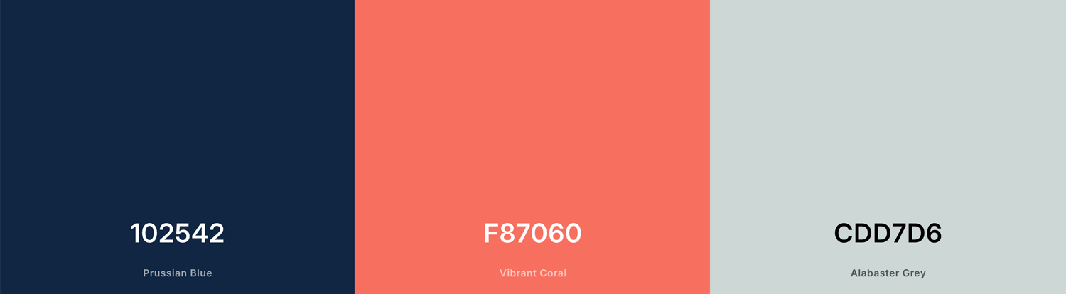
Once you have your main color, choose one accent color to create contrast and draw attention to important elements such as buttons, links, icons, or calls to action.
Your accent color does not have to be completely different from your main color. You can use a complementary color for stronger contrast, or choose a different shade of the same color for a more subtle look.
Try not to use too many accent colors. If everything is colorful, it becomes harder for visitors to know what deserves their attention.
Choose Background and Text Colors
Your main color does not necessarily have to be your background color. In most cases, it is better to use your main color for elements such as buttons, links, headings, icons, or other parts of your visual identity.
For the background, neutral colors are usually easier to work with. White, off-white, light gray, dark gray, or black can give your main and accent colors enough space to stand out.
The same applies to text. Choose a text color that has enough contrast with the background and is comfortable to read. Pure black on white is not your only option. Dark gray can create a softer look, while light gray or off-white can work well on a dark background.
If you want a more expressive design, you can also use a colored background. Just make sure that your text and other important elements remain easy to see.
How to Combine Colors
If you already have a main color, there are several simple ways to find colors that work well with it.
Monochromatic: Use different shades and tones of the same color. This is one of the easiest ways to create a cohesive website palette.
Analogous: Choose colors that sit next to each other on the color wheel. For example, blue, blue-green, and green can create a harmonious combination.
Complementary: Choose a color that sits opposite your main color on the color wheel. This creates stronger contrast and can work well when you use the complementary color only as an accent.
Main color + neutrals: Combine your main color with white, off-white, gray, beige, brown, or black. This is a simple option if you want your main color to stand out without creating a very colorful website.
You can also combine a strong main color with a softer or darker version of another color instead of using two equally bright colors. This usually creates a more balanced result.
If you are not sure which combination to choose, start with your main color and one neutral color. Then add one accent color if you feel the design needs more contrast.
Use a Color Palette Generator
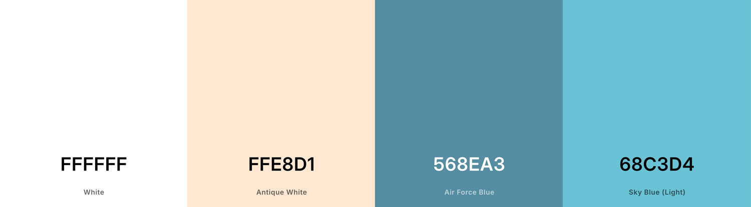
If you find it difficult to combine colors yourself, you can use an online color palette generator. These tools can suggest color combinations based on color theory, generate palettes from scratch, or even extract colors from an image.
Here are a few tools worth trying:
- Coolors — a simple option for quickly generating and exploring color palettes.
- Adobe Color — useful if you want to experiment with color harmonies such as complementary, analogous, or monochromatic combinations.
- Canva Color Palette Generator — useful for creating a palette from a photograph or another image.
- Paletton — a good option if you want to explore relationships between colors using a color wheel.
- Color Hunt — useful when you want to browse ready-made palettes for inspiration.
You do not have to use the first palette a generator gives you. Treat it as a starting point and adjust the colors until they fit your brand, content, and website style.
Check Color Contrast and Accessibility
A beautiful color palette is not enough if some visitors cannot read your content. Good color contrast is an important part of accessible web design because it helps people with visual impairments, color vision deficiencies, or simply difficult viewing conditions read and interact with your website.
This is also important for the overall quality and usability of your website. If your text is difficult to read, visitors may leave the page instead of trying to figure out what it says.
For example, light gray text on a white background may look subtle and elegant, but it can be difficult to read. The same applies to colorful text placed over a busy image or two similar shades used for buttons and their backgrounds.
A simple way to check your palette is to use an online contrast checker. Tools such as WebAIM Contrast Checker let you enter your text and background colors and check whether they have sufficient contrast.
As a general guideline, WCAG recommends a contrast ratio of at least 4.5:1 for normal text and 3:1 for large text. Some larger interface elements and graphical elements have different requirements.
Do not rely on color alone to communicate important information either. For example, instead of showing an error only with red text, you can also add an icon or a clear error message.
Good accessibility does not mean that your website has to look boring. You can still use unusual, dark, colorful, or experimental palettes. You just need to make sure that important content remains readable and that visitors can use your website comfortably.
Create a Website Color Palette Example
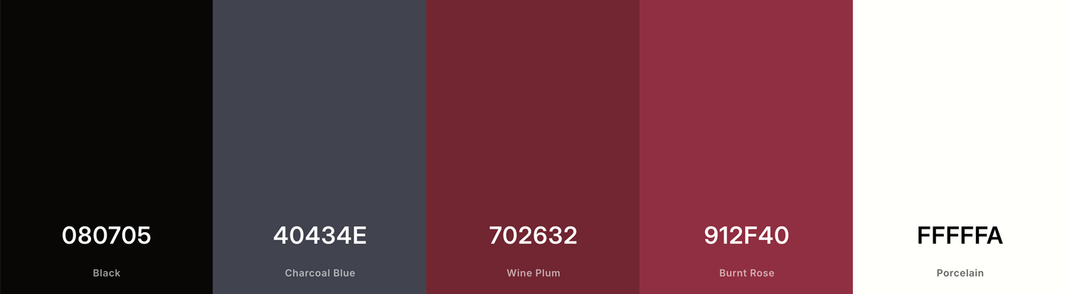
To see how these ideas can work together, here are two simple website color palette examples. You can use the same basic approach for both light and dark websites.
Light Website Color Palette
A light website does not have to use pure white. Combining an off-white background with a dark text color and one stronger accent can create a softer and more interesting result.
- Background: #F5F2ED
- Text: #252525
- Main color: #526A5A
- Accent: #C46A4A
- Light accent: #D9DED7
This type of palette could work well for a photography website, creative portfolio, interior design studio, or a brand with a natural and calm feeling.
Dark Website Color Palette
Dark websites give you a little more room to experiment with strong colors. Instead of using black for everything, you can combine a very dark background with a softer text color and one distinctive accent.
- Background: #111111
- Text: #E8E4DE
- Main color: #7B5C8E
- Accent: #D7A84B
- Secondary background: #211E24
This palette could work well for a creative portfolio, fashion brand, music website, photography project, or a more experimental visual identity.
These are only examples, not fixed rules. You can change the shades, saturation, and contrast to create a completely different atmosphere while keeping the same basic structure.
Soft & Natural Design
An off-white background combined with dark text and sage green tones creates a comfortable reading experience without high glare.
Explore Light ModeDeep & Atmospheric
Using a deep violet-charcoal background with warm off-white text and gold accents adds depth and elegance while reducing eye strain.
Explore Dark ModeFinal Words
Choosing colors for your website can feel difficult when you are not a professional designer. However, you do not need to know everything about color theory to create a good-looking and functional palette.
Start by thinking about your brand, the emotions you want to communicate, and the overall atmosphere you want to create. Then choose a main color, an accent color, and suitable background and text colors.
Keep your palette simple, make sure there is enough contrast, and do not be afraid to experiment with different shades and combinations. If you are struggling to find colors that work together, an online color palette generator can give you a useful starting point.
Remember that color is only one part of your website’s visual identity. Fonts and typography are another major part of the design and deserve their own article. The fonts you choose can completely change how overall design feel.
The most important thing is that your visual choices work together. Instead of distracting the users, they make the site more understandable and usable.
FAQ
Most websites can work well with three to five main colors. A simple palette usually includes a background color, text color, primary color, and one accent color.
There are no universally best colors. Choose colors that fit your brand, content, and target audience while keeping enough contrast for easy reading.
Start with your brand, logo, photos, or the mood you want to create. Choose one color that represents the overall style of your website and build the rest of the palette around it.
Neutral colors combined with one strong accent color are an easy starting point. You can also use monochromatic, analogous, or complementary color combinations.
Use a color contrast checker to test your text, buttons, and other important elements against their backgrounds. Make sure there is enough contrast for people to read and interact with your website comfortably.